Pantone Colour of the Year 2022: How to Use It In Your Home
Pantone’s colour of the year for 2022 is called Very Peri. For some, the colour of the year looks more purple. To others, this colour is blue. What do you think?
Technically, it’s both. This colour is a periwinkle blue with violet and red undertones. No matter where this colour lands on the spectrum, we can all agree that it’s bold and vibrant. During the COVID pandemic, we’ve all experienced the importance of creativity and the arts. This colour is committed to bringing out the playful, creative side in us all.
Sometimes, using bright colours in interior design can be tricky. A bold colour like Very Peri can be hard to use in interior design if you’re unsure how to approach it. This could turn some away from even trying, and we don’t want that! So, here are our top tips for using Pantone’s colour of the year 2022 in your home.
1. Wall colour
A deep purple wall may seem far-fetched, but this luxurious deep periwinkle colour can bring a calming and warm atmosphere to any room. It makes a great colour for an office or creative space. Don’t want to commit to an entire wall? Consider painting a door to showcase the European vibe that we love in historic neighbourhoods around Victoria.
2. Furniture features
Playing with vibrant and colourful furniture pieces is a great way to show your personality and add a touch of chic elegance to your home. Using colour in interior design is more than wall colours and cabinet doors. It’s also a vibrant purple accent chair to breathe life into your living room.
3. Art that steals the show
Art is a great way to bring colours into your home without having to go as big as a feature wall or a purple sofa. If you already have colours that would pair well with this vibrant purple hue, even better! Art is a great way to introduce a new colour alongside other colours in your space to pull the entire look together.
4. Decorative items galore
Using decorative items to pull in vibrant new colours can change the overall look of your home but don’t require the same commitment as a larger furniture item or piece of art. Consider some throw pillows or a decorative vase to infuse some Very Peri into your home.
5. Complimentary pairings
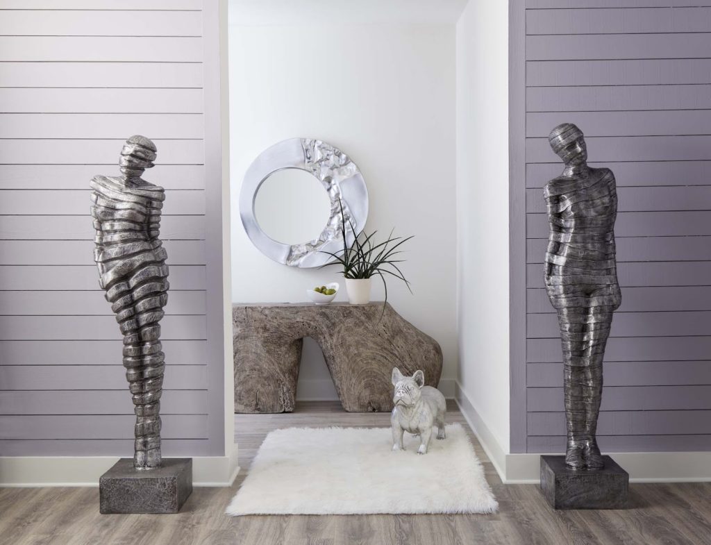
The Pantone colour of the year was made to partner with grey and white. This stunning mix of blue and purple means that Very Peri pairs well with various colours, but we love it with grey and white the most. IT brings a feeling of regal warmth into a space and can offset the sometimes cool nature of grey and white furnishings.
Are you still having difficulty envisioning this vibrant periwinkle colour in your home? Our team of interior designers is here to help. If you want to try something creative and fresh this year, our team can help you find the perfect way to bring bright colour into your home without it feeling forced. Get in touch with us today or come and visit us at 564 Yates Street in downtown Victoria.

